Headless UI v1.5: The One With Comboboxes
- Date
 Jonathan Reinink
 Adam Wathan
We just released Headless UI v1.5, which includes a brand new Combobox component. Comboboxes are like select controls but with autocomplete/typeahead functionality, and are a great alternative to a regular select when you’re working with large datasets and want to quickly filter for the right option.

Like all other Headless UI components, the combobox abstracts away all of the complex accessibility considerations but leaves the styling completely up to you, giving you total control to design exactly the combobox you want without worrying about things like keyboard navigation or screen reader support.
Here’s a quick demo if you’d like to see it in action:
- Wade Cooper
- Arlene McCoy
- Devon Webb
- Tom Cook
- Tanya Fox
- Hellen Schmidt
We’ve intentionally designed it so that you have full control over filtering the actual results. You can do basic string comparisons, use a fuzzy search library like Fuse.js, or even make server-side requests to an API — whatever makes sense for your project.
Here’s what it looks like to filter the results using a basic string comparison:
import { useState } from 'react'
import { Combobox } from '@headlessui/react'

const people = [
  'Wade Cooper',
  'Arlene McCoy',
  'Devon Webb',
  'Tom Cook',
  'Tanya Fox',
  'Hellen Schmidt',
]

function MyCombobox() {
  const [selectedPerson, setSelectedPerson] = useState(people[0])
  const [query, setQuery] = useState('')

  const filteredPeople =
    query === ''
      ? people
      : people.filter((person) => {
          return person.toLowerCase().includes(query.toLowerCase())
        })

  return (
    <Combobox value={selectedPerson} onChange={setSelectedPerson}>
      <Combobox.Input onChange={(event) => setQuery(event.target.value)} />
      <Combobox.Options>
        {filteredPeople.map((person) => (
          <Combobox.Option key={person} value={person}>
            {person}
          </Combobox.Option>
        ))}
      </Combobox.Options>
    </Combobox>
  )
}Command palettes
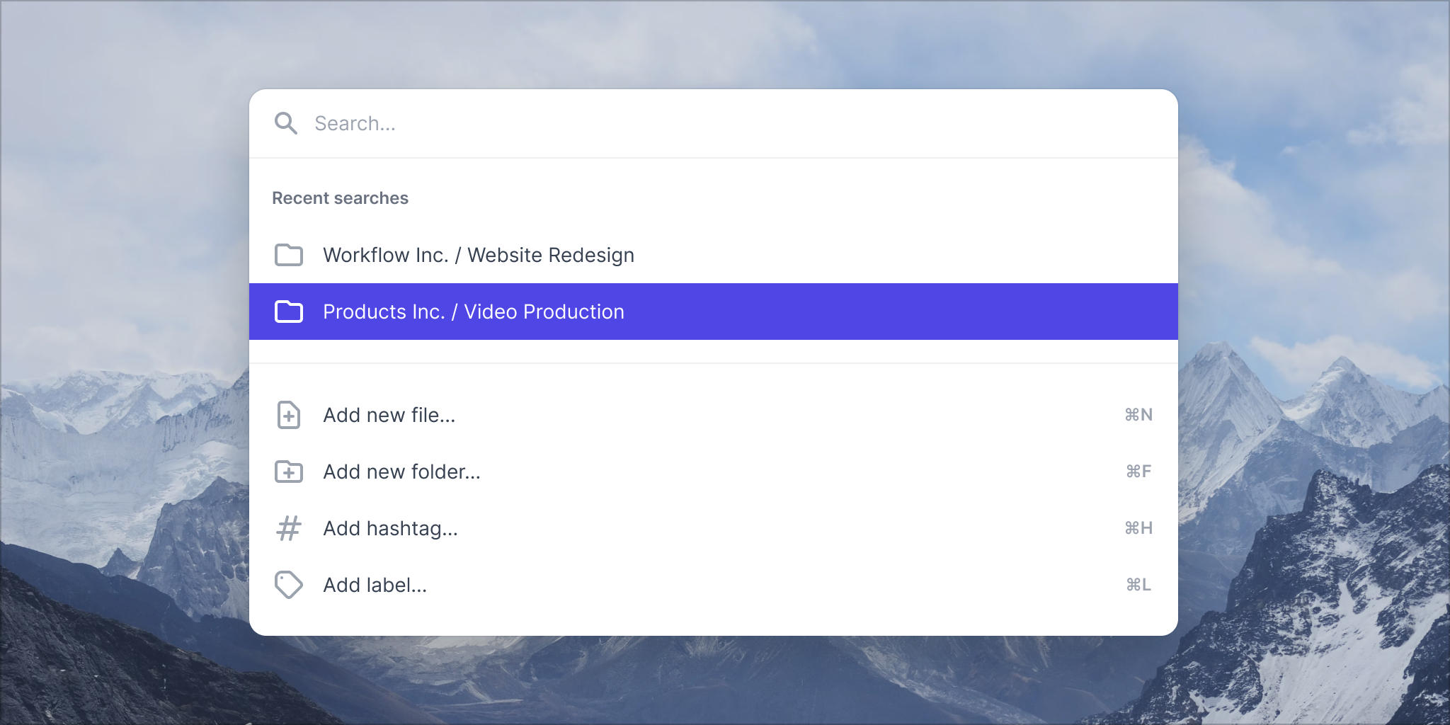
Comboboxes are not only great as standalone inputs, but they can also be used as a lower-level primitive for building more complex components, such as command palettes.
This is actually what originally motivated us to create the combobox component in the first place — we wanted to add a new command palettes category to Tailwind UI and needed this component to make that happen.
If you happen to have a Tailwind UI license, be sure to browse the new Command Palettes category to see how these turned out. And if you’re wondering, we also added a new Comboboxes category as well.

Riding on the excitement of the new command palettes, we also just published a new in-depth screencast on building a command palette from scratch with Tailwind CSS, React and Headless UI.
It covers tons of interesting Tailwind tricks for getting the design and animations just right, and teaches you a ton about how to use the new combobox component and wire it into your app.
Try it out
If you already have Headless UI installed in your project, be sure to upgrade to v1.5 to get the new Combobox component. This is a minor update so there are no breaking changes.
# For React
npm install @headlessui/react

# For Vue
npm install @headlessui/vue
Be sure to also check out the official website for the latest documentation.

